-
Architects: HACEDOR:MAKER/arquitectos
- Area: 2425 m²
- Year: 2015
-
Photographs:José Fernando Vázquez Pérez
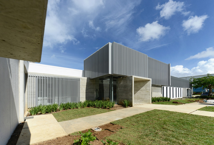
Text description provided by the architects. SARCO is an adaptive reuse of an industrial facility, converted to serve as the new administrative headquarters for the South American Restaurants Corporation, a regional restaurant franchise operator. The original 50,000 ft2 structure, assembled with tilt-up concrete walls, and steel roof, beams and columns, was built by Wyeth-Ayerst Pharmaceuticals in the 1980’s, distributed as a larger 32,000 ft2 warehouse, and a smaller 18,000 ft2 administrative-industrial wing.

The original building was hermetic and dark, with few narrow windows; its square, boxy plan meant that only the peripheral offices had any visual access to the outside, and its maze-like interiors minimized natural light, and did not allow for easy reuse. The building’s original architecture was simple but generic, and its only stylistic feature was an indented “W” motif on the top part of the façade panels, as a slight reference to Wyeth’s original logo.

The new program required the consolidation of previously dispersed operations into a single space, so an architectural strategy of “opening” the building in plan, façade, and roof, was established in order to allow for a naturally lit, and denser new occupation.

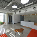
Most interior walls were eliminated, and new, low working stations created, allowing for a loft-like central space. Private offices were again laid around the periphery, but this time using glass internal walls, which combined with new window openings [marked in the façade as exposed concrete volumes], multiple skylights, and a central clerestory, allow natural light penetration into the interior of the building. [While the original building allowed for only 30% of its working space to be illuminated by natural light, the new one provides natural light and exterior views for 70% of the working space; only 10% of the space now lacks views to the outside.] The executive closed offices are mediated from the “cubicled” working area by an open, lounge-type zone, which allows for impromptu meetings, and informal gatherings.

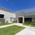
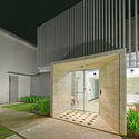
The old reception-entrance area was cleared from all unnecessary surfaces [doors, storefront, suspended ceilings], and refitted with a glass “skin”, skylights, and an exposed concrete portico.

An original standing-seam entrance canopy was preserved, but was camouflaged by a custom aluminum screen of tubes and angles that variously works as a solar shade, and as as an architectural camouflage to the “W” façade pattern. Other exposed steel and concrete volumes mark areas of new intervention, contrasting against the white-painted, rough-plastered original structure.

The project preserves 90% of the original structural frame, walls and roof, but with strategically placed new building envelope alterations, an interior space reconfiguration, new surface finishes, and furnishings. Floors in the entrance, cafeteria, and main corridors are resurfaced with concrete terrazzo, while the office space is covered with color-coded carpeting.
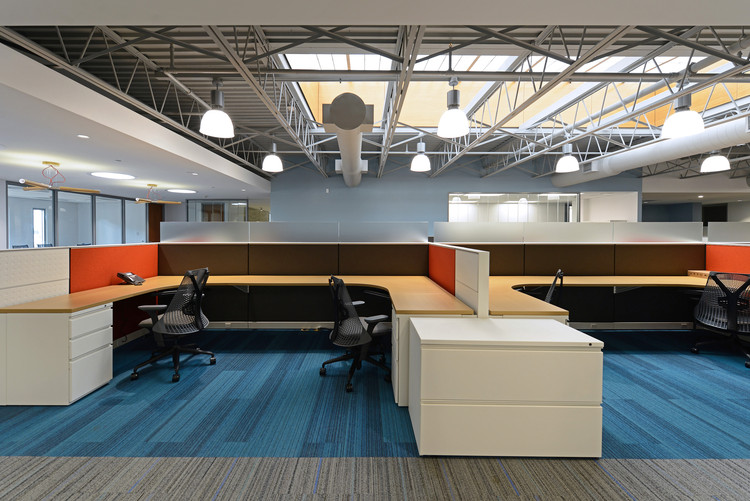
Since sunny days allow for full natural illumination, a “smart” illumination control system was specified. The new LED-based lighting is periodically adjusted according to sunlight incidence, to maintain a continuous illumination level throughout. The same “smart” controls govern a high-efficiency a/c, which also varies its output according to general environmental conditions and occupancy in each space. The intervention included the design of all interior fixtures, including custom designed chandeliers [visible in the reception and executive working area], FSC-certified wood cabinetry, and contract pieces from Herman Miller.

The project, which initially aimed for LEED certification, has a projected annual electrical consumption of 63% of the original structure’s consumption. A PV array was also conceived but postponed for a later phase, due to budgetary considerations.


